Back in “Curiosity, golf math, and another tool for your classroom,” we explored the high-speed video capabilities of the iPhone 6 and talked about how we might use this tool to develop interesting mathematical modeling problems. High speed photography, like that of the iPhone, lets us “see fast.” That is, we can use that tool to see things that happen more quickly than we can ordinarily perceive.
Well, the iPhone (and iPad, and iPod touch) lets us go in the other direction as well. We can take advantage of the time-lapse photography mode and see slow. That is, we can capture things that happen so slowly that the change is not within our typical perception of events.
One of my favorite summertime “seeing slow” things to do is to get up early and watch the sunrise over the ocean. This year, I was fortunate to have a chance to spend a few days in Cape May, NJ, with beautiful weather, and plenty of opportunities to watch the sunrise. I decided to take this opportunity to explore the time-lapse capabilities of the iPhone and to think a bit about how we might use time-lapse video to create mathematical modeling opportunities in the classroom. Here’s one video I took that spans about 30 minutes of real-time and 27 seconds of “time-lapse” time:
In time-lapse mode, the iPhone dynamically chooses the frames per second captured for a time-lapse video, with the frame rate dependent on the total length of the video. For a video that is between 20 and 40 minutes long, like this one, it takes one frame per two seconds and then speeds up the playback time to 60 times normal speed. If the normal playback speed in 30 frames per second, it is now playing the equivalent of 1800 frames per second, so we see 60 seconds of real time for every one second of video. That’s what you are watching in this video.
Now, watching the sun rise like this got me to wondering – how many students have actually seen the sun rise? How many have thought about how “brightness” changes as we go from dark to light? If I asked my students to plot “brightness” versus time as we transitioned from before sunrise to after, what would their plots look like? If you get a chance to ask your students this question, please share their thinking!
In the meantime, let’s see what we can actually learn about how brightness changes using our time-lapse video of a real sunrise. Along the way, we’ll learn a little bit about image processing, and pick up a few more tools for you and your students to use during your investigations.
We’ve already seen how easy it is to collect data using an iPhone or similar device in the form of video. The problem is that video isn’t the most convenient format to use when what we want is numerical data. It is generally much easier to extract numerical data from a still photo. So, the first thing we need to do is extract individual frames from our video. Fortunately, this is pretty easy and you can do the job with a free piece of software called VLC Media Player. It’s ad free, easy to use, and available for just about any operating system you choose. You can easily find instructions as to how to do the frame extraction from video, so I’ll let you read about that elsewhere. This web page is a good start.
The more interesting question is what to do with the still photographs once you have them. This is where we need to do a little image processing and to do that it’s helpful if we know how to do a little coding. In fact, knowing how to do a little coding is pretty much an essential skill for the mathematical modeler. At the very least, being able to do a little coding vastly extends the range of what you can do with your mathematical models and for models that are mathematically complex, being able to code and obtain a numerical solution to your problem is often the only path forward. So, I’d advocate having your students learn to tap into the power of computing every chance you get! There are an incredible number of programming languages available now, many designed for the first time coder and for very young students, so this isn’t nearly as challenging as it was even twenty years ago. I’d urge you to spend a little time playing with languages like Scratch and the one we’ll use today, Processing.
Here, I’m going to advocate using Processing because it is open-source (free!), easy to learn, and powerful enough for just about anything you might want to do. It’s also the platform for the language used by the Arduino, so learning Processing also gives you access to playing with microcontrollers and extends your range in that dimension as well.
Now, to do our image processing, all we need to do is load individual images using a simple Processing sketch and then use the built-in function “brightness” to read off the brightness of selected pixels in our image. I selected 7 frames from the video above, evenly spaced in time, selected 5 pixels in each frame, and determined an average brightness for the image by averaging the brightness of each of those 5 pixels. That is, I did this quick and dirty. If you do this with your students, this is a good point to have a conversation about which pixels to select, how to select them, how many to select, and so on. But, for our purposes here today, this let me quickly make a plot of how the brightness of the beach during our sunrise changed with time. Here’s what my plot looks like:
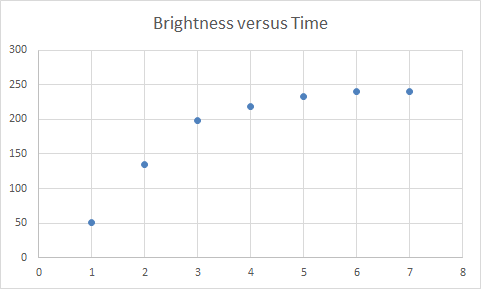
Note that the frames I selected, again evenly spaced in time, span the entire period from “dark” to “light” in the video above. Now also note, we’ve taken the video and our qualitative view of “things getting brighter” and extracted quantitative information that we can start thinking about and playing with.
As soon as we see this plot, we start to wonder – Why does it have this shape? Boom! There’s a modeling problem. We’ve taken an observation about a pattern (it gets brighter outside as the sun rises), and turned it into something quantitative that we can now try and explain. We can ask plenty of related questions here. Can we explain this data based on what we know about how the Earth rotates? What would this data look like if we followed it for the whole day? Several days? A year? What would the data look like if the Earth were flat and the sun revolved around the Earth? What would this curve look like if we were in Alaska? Or, in Arizona?
If you wanted to move from the sort-of “hey I went on vacation and noticed this” kind of motivation for this investigation to something more practical, you don’t even have to work very hard. Understanding how brightness varies where you are is, of course, essential to understanding whether or not solar energy is a viable alternative energy source for you. Google has actually recently launched “Project Sunroof,” where they are developing a “solar recommendation calculator,” based in-part, on precisely this type of information. Having your students model how the brightness of the day changes can be both fun and eminently practical.
So, you have a few more potential tools for your classroom as you work to incorporate mathematical modeling into your teaching – time-lapse photography, image processing, simple coding and perhaps inspiration to build a modeling investigation around sunrises or solar energy. If you want to explore any of these in more detail, drop me a line. I’m happy to talk more or help in any way I can. In the meantime, I hope you enjoyed contemplating the sunrise in a new way.
John